Online interactions are critical to both meeting business objectives and delighting customers alike.
To create an engaging interface or experience, I try to be as objective as possible when I examine how an end user would approach it; what is their goal, and how can I make it more easily attainable? Below are examples of work I've created over the past several years when tasked with projects involving interfaces and user experience.
In August of 2019, Extreme Networks formally acquired Aerohive Networks (where I previously worked as the Creative Director). In addition to being the Creative Director, I was also tasked with overseeing and directing the web team.
One of the first projects with this team was to look at the data behind the website, and provide a report on actionable areas of the site that could be improved from an end user’s perspective.
My team and I ran and analyzed heatmap data over a statistically significant amount of web traffic coming in to the site from the index; because the vast majority of users would drop less than half way down the page, we saw the most opportunity in modifying the header to provide relevant information to the end user by way of the hero.
I developed a report on this anomaly, as well as a few other areas where the data overwhelmingly showed us we could improve user experience and messaging — and presented it directly to the CMO and CEO, who were wholly in support of suggestions on how to improve the site.

Fixing the Scroll; A Saga in Two Parts
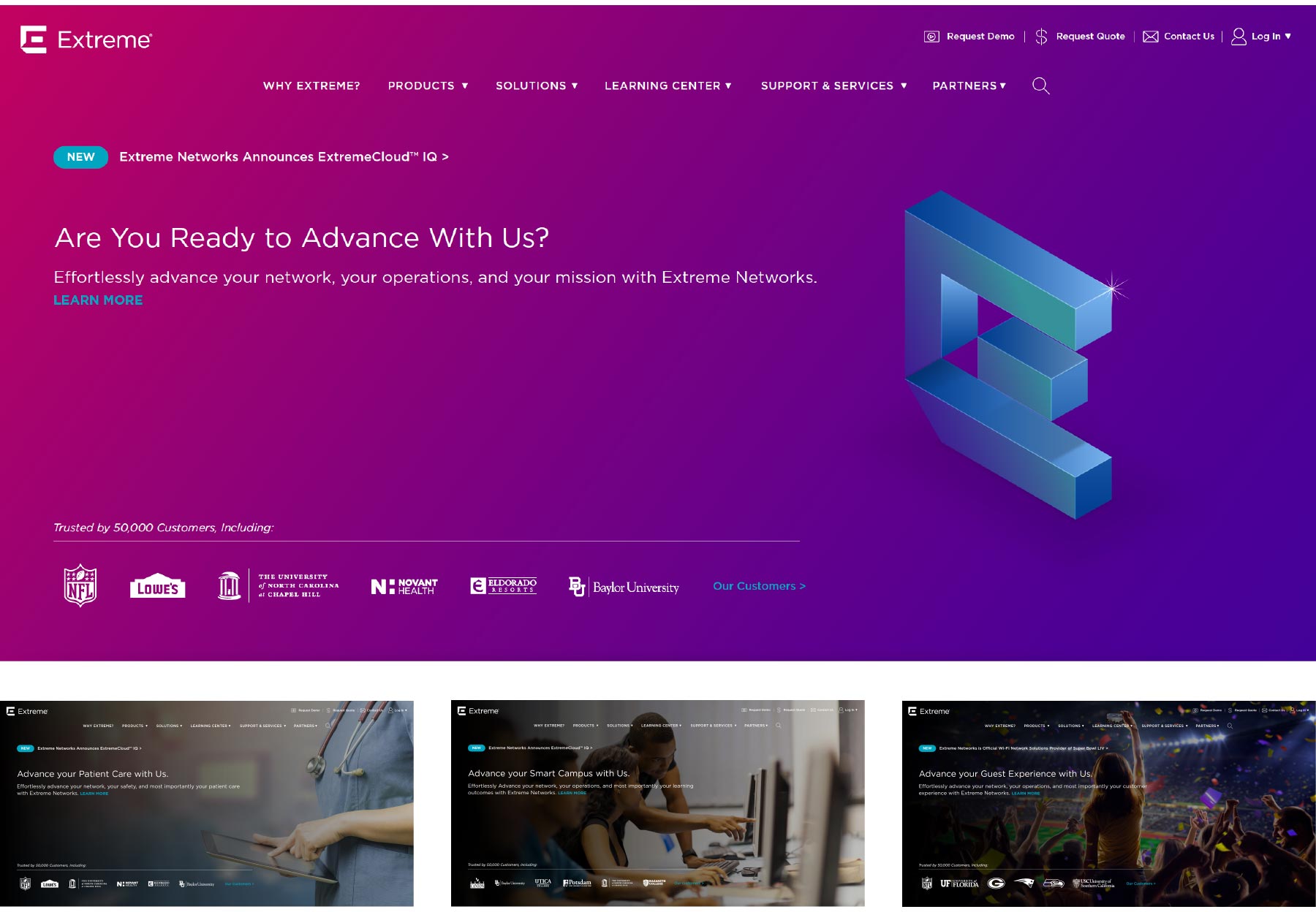
One design decision I made was to include a caret at the base of the hero, to indicate that there was more content below. Ultimately, visually suggesting to the end user that there was more content below the fold led to a substantial increase in traffic below the fold. Nice.
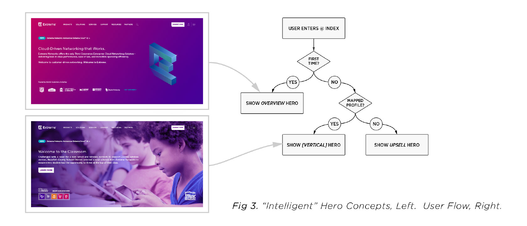
The second solution was considerably more complicated. If the hero was the main focal point of the end user, why not utilize that space to inform them of solutions we had that were exclusively pertinent to their line of work? After all, our goal was to focus on the person, and how to make their lives (and work) easier.
With the help of several mapped databases in our tech stack and one clever client-side cookie, we were able to accurately identify the profession of almost 60% of users by the second time they’d entered our site; thus, I presented a solution whereby we could give the end user only the information most relevant to them. This decision more than tripled traffic to solutions pages, especially those by vertical. These pages proved to be incredibly valuable for both champions and decision makers alike.
Below: a flow chart of the logic behind the Smart Hero, as well as the “generic” corporate messaging, and several examples of verticals-based strategic messaging developed. This data and solution were presented to the Board of Directors, who approved the concept prior to launch.
Giving Choice Back to the End User: Product Pages
Another instance of improvement from the end user’s perspective: Extreme had previously only linked to external PDFs when providing information on the hardware end users were looking for. On top of that, a devious plugin in their wordpress stack would actually just render an image of the PDF as a JPG — which was lossy, difficult to read, and impossible to search. It was literally a lose-lose scenario for company and consumer alike.
I proposed a system that would display the content from the PDF as part of the webpage (a la variables in the CMS’ templates), and when the time came for the End User to further engage with the content, the page would dynamically generate a PDF based on not only the hardware they were interested in, but also the variations of the hardware — e.g., the number of ports the End User needed, feature sets of the hardware, etc.
There was an additional CTA that would allow for the end user to talk about their solution with a Sales Engineer as well, in case they still had questions about the hardware they were selecting. Giving consumers choice on how they interact is incredibly effective as a sales tool.
Below are captures of the spec sheet, as well as the end product. Please reach out to me directly if you’d like more in-depth knowledge on either of these projects; I’d love to share.


While at Brightedge, I redesigned the in-product dashboards to create a more cohesive user experience. Since these dashboards contained many different pieces of information, a clean unified design aesthetic brought them all together.
These redesigned dashboards greatly contributed to a more unified user experience, as previous dashboards all varied in style, size, and information density.

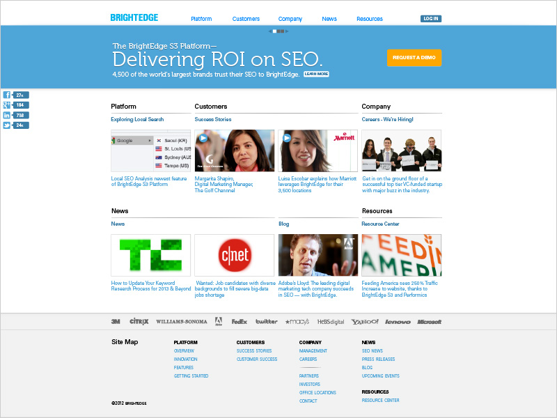
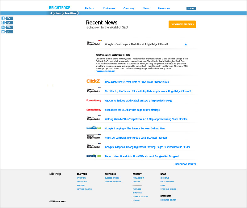
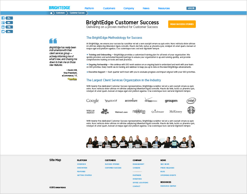
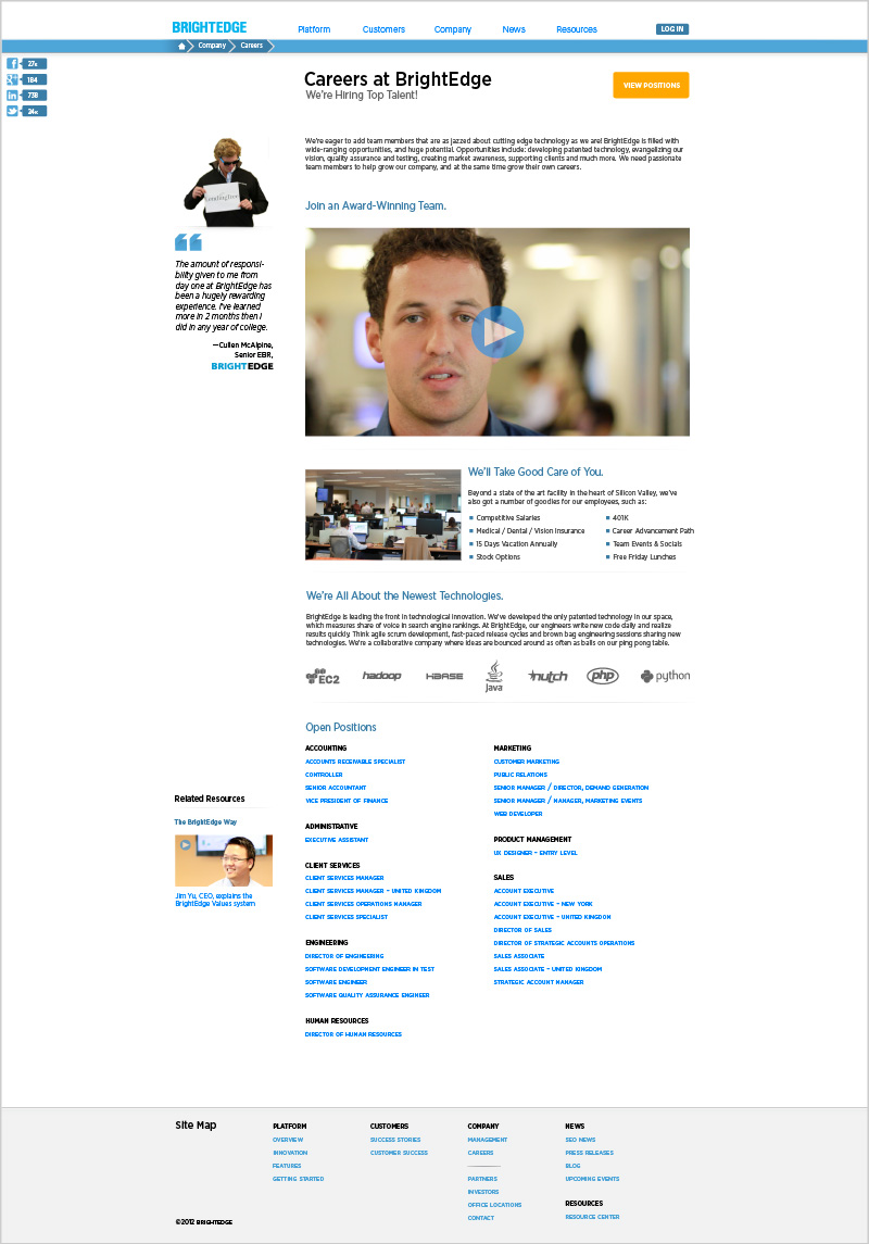
Along with rebranding Brightedge from a corporate and product perspective, I was the sole designer in developing a new Brightedge site.
Besides having to consider the end user, I also had to consider internal upkeep of the site; the final product was developed on Drupal, with many considerations for how best to implement a site that could be quickly updated regularly.
Stylistically, the site was inspired by the idea of "cards" of information on the front page, some of which were populated dynamically. Subsequent pages were developed with a similar 16 column grid system, to give a consistent feel across the digital property.

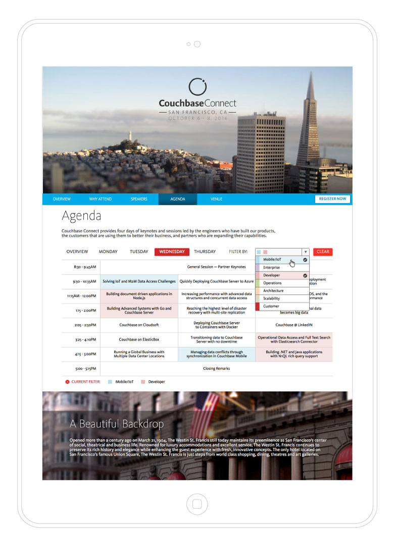
I designed and coded the event website to promote the first Couchbase Connect; one of my favorite aspects of this site was the Agenda / Schedule, which used the HTML5 data attribute to semantically tag each event, that the user could then filter sessions by. This widget allowed the user to highlight each piece of the event relevant to their interests.
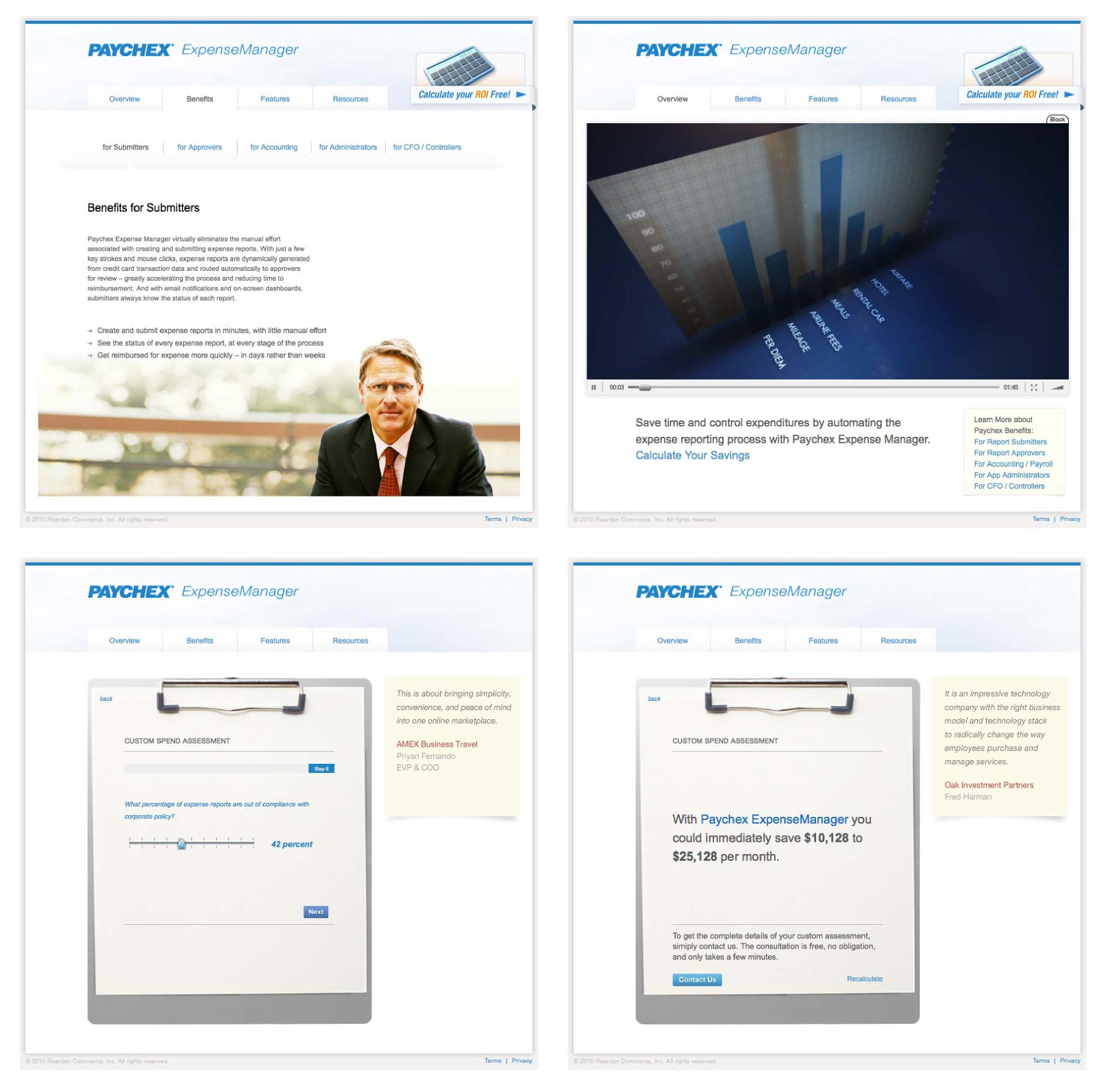
Over a decade ago, I was approached by Paychex — a 40 Billion Dollar juggernaut in their industry — to design and code a microsite extolling the benefits of Paychex ExpenseManager, a white-label business solution for Business T&E. The result was a comprehensive overview video, benefits described per business role, and an expense calculator. Based upon the wizard-based assessment, the user would be given a range of possible savings, and the ability to learn more.
From a Demand Generation perspective, one fantastic thing about this process is that it logged all of the user's answers, and pushed them into Marketo / Salesforce if the user wanted to contact Paychex for more details. This sounds like a small detail, but the ability for the sales team to have access to this data prior to ever even making a discovery call was incredibly useful.
