A well-crafted and designed presentation brings information to your audience in a clear manner; I find the best presentations to be visually engaging, and not just sets of bulleted lists running down the screen, allowing the presenter to talk TO the slide, and not just read it aloud.
From wayfinding to keynote presentations and back, every aspect of an event is affected by design. Good designs clearly and simply communicate ideas and information, and with events there are innumerable opportunities to do just that. Following are several shots from events I’ve directed and created artwork for over the span of the last six years.
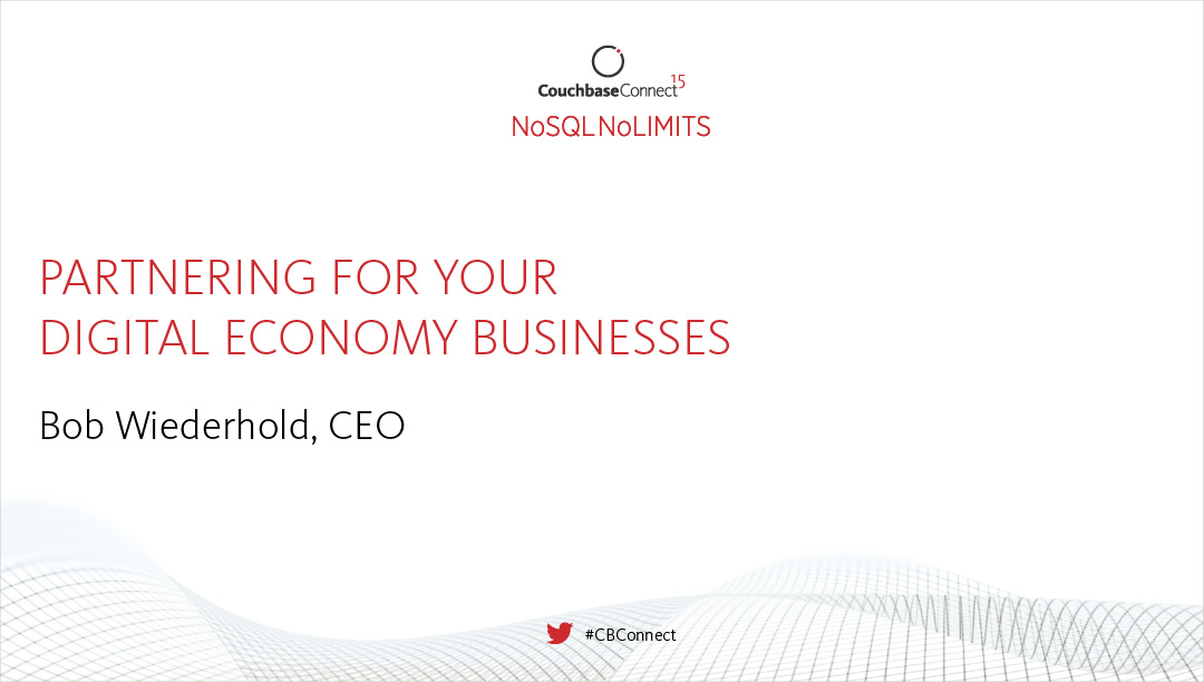
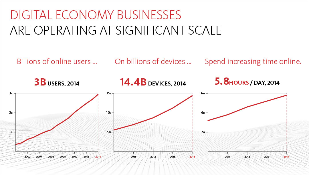
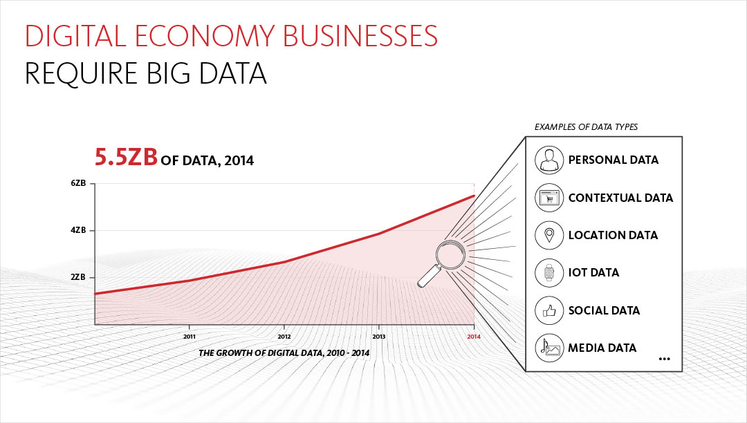
These are slides from one of several Keynote presentation developed for Couchbase, delivered to an audience of 1800 people. The emphasis is on the visual elements that validate the compelling story of the digital economy by way of charts, graphs, and iconography.

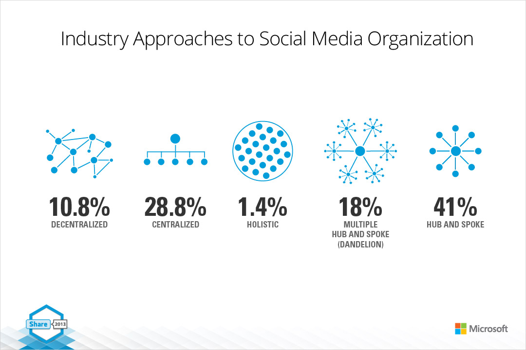
When developing presentations for large-scale events, I've often been approached by strategic corporate partners to help them develop presentations as well. This requires the ability to creatively tell their story, while being conscientious of their brand (and respectful of guidelines) at the same time. This presentation was designed for Microsoft.


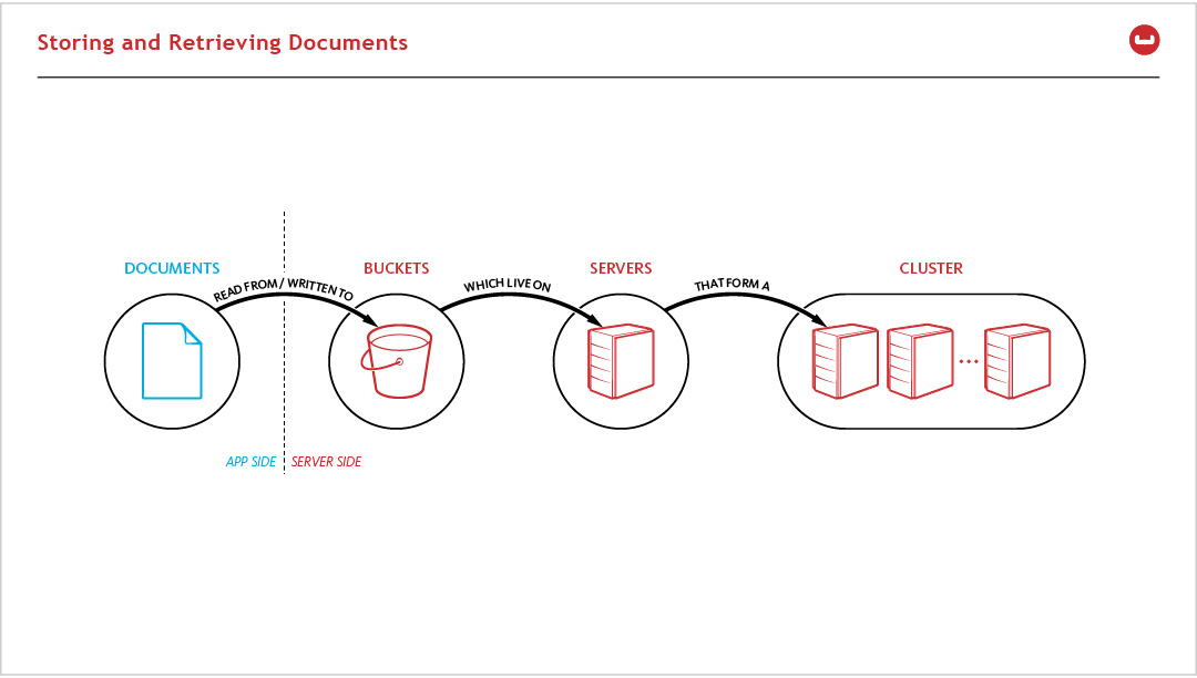
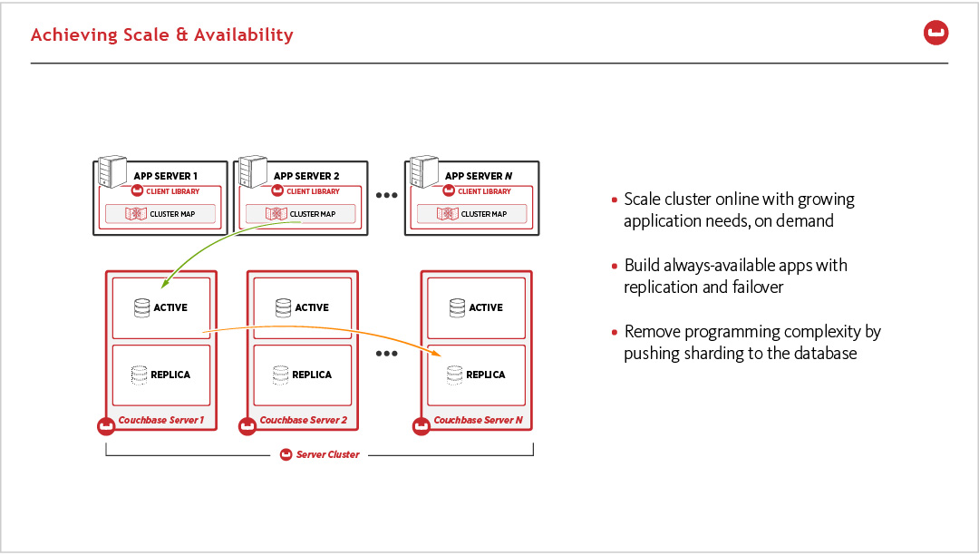
Technical presentations need to find a balance between simply representing the underpinnings of complex systems and providing enough detail to hold the interest of a more technical audience. Here's an example from my time with Couchbase:

